
Today, a brand must develop awareness (its notoriety), everyone knows it. And if you didn't know it yet, we'll explain. It is very simple. Having a strong brand awareness allows you to generate more leads (prospects) to finally increase your turnover. We told you it was simple 😉
By developing your notoriety, your future customers will have more confidence in you and your skills... They will then be more open to a potential collaboration. The development of notoriety is a key factor in the success of a business!
Et cela passe notamment par l’image de marque et ses valeurs. Pour ce faire, on vous présente un outil tout simple à réaliser : le Brand Book (ou livre de marque). Vous vous dites sûrement « c’est quoi ça encore ? » Pas de panique ! On vous explique tout ce qu’on sait sur le sujet.
In this article, we reveal how to create this essential document for any brand. But also its advantages, examples of brand books from (very) famous brands, the steps to follow and finally some advice from the Duck team! Are you ready? Let's start at the beginning.
Table of contents
What is a brand book?
Why make a brand book?

The steps from A to Z to create a brand book for your brand!
#1 Introducing your brand
Start by presenting your business, who you are, your history,...
Your vision
Contrairement à votre mission qui est liée au présent, votre vision sera une projection dans le futur. Demandez-vous où vous voulez aller sur le long terme. La vision d’une entreprise peut évoluer mais elle impactera vos décisions aujourd’hui.
Alors, vous imaginez comment votre business dans 5, 10, 20 ans ? Quelle est votre destination ? Soyez ambitieux, cohérent et précis. Votre vision doit tenir en une seule phrase.
Prenons l’exemple d’Amazon et sa vision: “être l’entreprise la plus axée sur le client au monde”.
Your mission
Partagez votre mission de manière simple et claire. Pas de chichi. Votre mission doit être comprise du premier coup et mémorisable facilement. Votre mission correspond à l’ADN de l’entreprise, sa raison d’être : pourquoi l’entreprise existe-t-elle ? Expliquez uniquement pourquoi la marque a été créée et sa mission actuelle.
For example, LinkedIn's mission is simple: "to connect professionals around the world to make them more successful and productive." Simple and direct.
Your values
Les valeurs de votre entreprise sont les repères et principes sur lesquels elle repose. Il s’agit ici de l’application directe de votre vision au quotidien. Pensez à inclure vos collaborateurs dans cette démarche, ce sont eux les ambassadeurs de votre marque chaque jour.
Par exemple, les valeurs de Nike sont l’Authenticité, l’Inspiration et le Courage.
Your story
Racontez votre histoire. D’où vient la marque ? Quelle est son évolution ? Partager l’histoire de votre entreprise permet de personnifier votre business et de créer un lien avec le lecteur. Cette histoire doit être unique et conforme à la réalité, afin que chacun puisse s’y identifier.
Vos produits & services
Present an overview of your offer. Take the time to define your activities, products and/or services. Be as complete as possible and don't hesitate to indicate the Do's and Don'ts!
Your target audience
Who are your customers? Why do they need you? What are their challenges? Also define your targets.
Your vision
Unlike your mission, which is linked to the present, your vision is a projection into the future. Ask yourself where you want to go in the long term. A company's vision may evolve, but it will impact your decisions today. So, how do you see your business in 5, 10, 20 years' time? What's your destination? Be ambitious, consistent and precise. Your vision should fit into a single sentence. Take Amazon, for example, and its vision: "to be the most customer-centric company in the world".
Your mission
Share your mission simply and clearly. No fuss. Your mission must be understood at first glance and easily memorized. Your mission is the company's DNA, its reason for being: why does the company exist? Explain only why the brand was created and its current mission.
For example, LinkedIn's mission is simple: "to connect professionals around the world to make them more successful and productive." Simple and direct.
Your values
Your company's values are the benchmarks and principles on which it is based. They are the direct application of your vision on a daily basis. Remember to include your employees in this process, as they are the ambassadors of your brand every day. For example, Nike's values are Authenticity, Inspiration and Courage.
Your story
Tell your story. Where does the brand come from? How did it evolve? Sharing your company's story personifies your business and creates a connection with the reader. This story should be unique and true to life, so that everyone can relate to it.
Your products & services
Present an overview of your offer. Take the time to define your activities, products and/or services. Be as complete as possible, and don't hesitate to include the Do's and Don'ts!
Your target audience
Who are your customers? Why do they need you? What are their challenges? Also define your targets.
#2 The graphic charter
La charte graphique comprend tous les éléments qui constituent l’identité visuelle de votre marque. Une charte graphique est mise en place pour que tous les documents suivent les mêmes règles et restent fidèles aux principes graphiques. Et ce afin d’assurer une cohérence dans toutes les communications et d’être ainsi facilement identifiable par la cible.
Colors
Définissez quelques couleurs auxquelles vous vous tiendrez dans tous vos supports de communication (internes/externes, online/offline).
Utiliser toujours les mêmes couleurs permet de marquer l’esprit des consommateurs et d’être rapidement identifiable.Il n’y a pas de nombre à respecter. Vous pouvez choisir 2 couleurs comme vous pouvez en choisir 10. La majorité des marques sélectionnent maximum 4 couleurs pour garder une identité visuelle assez simple. Vous pouvez bien sûr ajouter des déclinaisons par couleurs.
Veillez bien à indiquer les noms et références de chacune des couleurs (CMJK pour l’impression, RGB et HEX pour le web) ainsi que les déclinaisons possibles dans le brand book.Chez Duckmotion par exemple, nous avons 2 couleurs principales et 4 couleurs secondaires. Mais attention, il y a des règles d’utilisation pour chaque couleur. Vous ne verrez jamais un titre rouge sur notre Insta ou site web… Notre graphiste, Justin, surveille qu’on respecte bien les règles définies 😉
Logo & baseline
Le logo est essentiel dans l’identité visuelle d’une marque. Il est suuuuper important de présenter les différentes manières de l’utiliser! Sinon, votre logo ne sera pas toujours respecté...
Les grandes marques ont plusieurs logos et déclinaisons en fonction des contextes et des supports de communication (flyer, social media, vidéo,...). C’est pourquoi, vous devez absolument poser par écrit les règles d’utilisation de votre logo en fonction de chaque contexte. Présentez-y votre logo et ses déclinaisons. Mais aussi, ses dimensions et son positionnement, l’espacement entre les éléments, etc. N’hésitez pas à présenter les do’s et don’ts avec des exemples concrets des erreurs à éviter (Spotify le fait très bien, découvrez son brand book à la fin l’article).
La baseline suit généralement les mêmes règles que votre logo mais elle nécessite tout de même quelques précisions claires.Une baseline est un slogan permettant d’ajouter une information supplémentaire au client. Elle sert de signature pour une marque et apparaît souvent à la fin d’une vidéo ou en bas d’une affiche par exemple.
Posez-vous ces questions : La baseline doit-elle toujours accompagner le logo ? Où la positionner par rapport au logo ? Quelle taille et espacement ?
Typography
Tout comme pour les couleurs, il est important de définir les typographies de votre marque. Nous vous conseillons de vous limiter à deux familles de typographies. L’une sera dédiée aux titres et l’autre aux textes.
Par exemple, chez Duckmotion nos deux typographies sont Avenir & ITC Avant Garde Gothic Pro. Pour la typo ITC Avant Garde Gothic Pro, il existe 3 déclinaisons : Book, Medium, Bold. Pour la typo Avenir aussi : Book, Roman, Black. On peut donc dire que nous avons au total 6 écritures différentes avec seulement deux typographies.
Illustrations & pictorgrams
Vous devez également préciser dans votre brand book l’utilisation d’éléments (s’il y a) comme des photos, des illustrations, des icônes et dans quel contexte.
Cela peut concerner les retouches photos, comment sont-elles éditées ? Quelles sont les couleurs à utiliser pour les icônes ? Quel type de pictogramme faut-il utiliser (traits fins, épais, remplis, etc.)? Où doit être inséré le logo ?
Soyez le plus complet possible et n’hésitez pas à nouveau d’indiquer les Do’s et Don’ts !
Colors
Define a few colors that you'll stick to in all your communication media (internal/external, online/offline). There's no set number of colors to choose from. You can choose 2 colors, just as you can choose 10. Most brands select a maximum of 4 colors to keep their visual identity fairly simple. You can of course add color variations, but be sure to indicate the names and references of each color (CMYK for print, RGB and HEX for web) as well as the possible variations in the brand book. At Duckmotion, for example, we have 2 main colors and 4 secondary colors. But be careful, there are rules of use for each color. You'll never see a red title on our Insta or website... Our graphic designer, Justin, makes sure we follow the rules 😉
Logo & baseline
The logo is an essential part of a brand's visual identity. It's suuuuper important to present the different ways of using it! Otherwise, your logo won't always be respected... The big brands have several logos and variations depending on the context and communication media (flyer, social media, video, etc.). That's why it's essential to set out in writing the rules for using your logo in each context. Present your logo and its variations. But also its dimensions and positioning, the spacing between elements, etc. Don't hesitate to present the do's and don'ts, with concrete examples of mistakes to avoid (Spotify does this very well, see their brand book at the end of the article). The baseline generally follows the same rules as your logo, but still requires a few clear details: a baseline is a slogan that adds extra information for the customer. It serves as a signature for a brand and often appears at the end of a video or at the bottom of a poster, for example. Ask yourself these questions: Should the baseline always accompany the logo? Where should it be positioned in relation to the logo? What size and spacing?
Typography
As with colors, it's important to define your brand's typefaces. We recommend limiting yourself to two families of typefaces. One will be dedicated to titles and the other to text. For example, at Duckmotion our two typefaces are Avenir & ITC Avant Garde Gothic Pro. For ITC Avant Garde Gothic Pro, there are 3 variations: Book, Medium, Bold. For Avenir too: Book, Roman, Black. So we can say that we have a total of 6 different scripts with just two typefaces.
Illustrations & pictorgrams
You also need to specify in your brand book the use of elements (if any) such as photos, illustrations, icons and in what context. This may concern photo retouching: how are they edited? What colors should be used for icons? What type of pictogram should be used (thin, thick, filled lines, etc.)? Where should the logo be inserted? Be as complete as possible, and don't hesitate to include the Do's and Don'ts!
An animated logo?
It's no secret that video attracts more attention than a static image. Animate your logo to stand out from your competitors, stand out from the crowd and give the image of a dynamic and trendy company.
Want to liven up your logo? Contact us !
Need help to establish your graphic charter?
We look forward to working together and discovering your world!
#3 The Editorial Charter
The graphic charter includes all the elements that constitute the visual identity of your brand. A graphic charter is set up so that all documents follow the same rules and remain faithful to the graphic principles. And this to ensure consistency in all communications and to be easily identifiable by the target.
The tone of voice
Le tone of voice est en fait la manière dont l’entreprise communique ses valeurs et sa vision à sa cible. Ce terme anglais désigne donc le ton utilisé par votre marque pour s’adresser à son audience.
Et des tonalités, il en existe des tas : sérieux, friendly, professionnel, drôle, rassurant,... Vous devez adopter un style qui matche avec votre image de marque, vos valeurs mais aussi votre public. Je suppose que vous commencez à comprendre que “cohérence” est le maître mot de cet article 🙂 Eh oui, si vous êtes dans le domaine juridique, vous n’emploierez pas le même ton qu’une agence d'événementiel par exemple. Une fois de plus, n’hésitez pas à rajouter les tonalités vers lesquelles il ne faut pas aller.
Le tone of voice vous permettra d’une part de vous guider dans la rédaction de tous vos contenus (emails, copy social media, articles de blog, devis,...) et d’autre part de dévoiler votre personnalité et d’engager avec votre communauté.
Editorial rules
En plus du ton à utiliser lors de la rédaction, vous pouvez préciser les mots-clés que vous aimez employer régulièrement ainsi que les émojis (si vous n’en utilisez pas, précisez-le!).
Faut-il utiliser des phrases plutôt courtes ou longues ? Est-ce que l’on tutoie ou vouvoie le lecteur ? Quelle est la longueur idéale d’un post sur Instagram ? Quels sont les mots à bannir ? Au plus vous serez précis et complet, au moins vous aurez de mauvaises surprises 😎
The tone of voice
Tone of voice is the way in which a company communicates its values and vision to its target audience. It refers to the tone your brand uses to address its audience. And there are lots of tones: serious, friendly, professional, funny, reassuring... You need to adopt a style that matches your brand image, your values and your audience. I guess you're beginning to understand that "consistency" is the key word in this article 🙂 And yes, if you're in the legal field, you won't use the same tone as an event agency, for example. Once again, don't hesitate to add the tones you shouldn't go for. The tone of voice will guide you in the writing of all your content (emails, social media copy, blog posts, quotes, etc.) and will also reveal your personality and engage with your community.
Editorial rules
In addition to the tone you want to use when writing, you can specify the keywords you like to use regularly, as well as emojis (if you don't use any, say so!). Should I use short or long sentences? Should the reader be on first-name or last-name terms? What's the ideal length of a post on Instagram? What words should be avoided? The more precise and complete you are, the fewer unpleasant surprises you'll have 😉
6 Examples of brand book
And here are some examples of brand books from well-known brands: Coca-Cola, Adidas, Vans, Spotify and McDonalds.
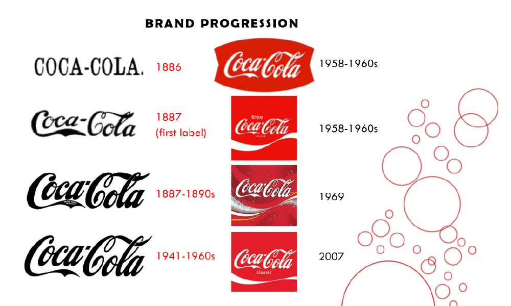
Brand book of Coca-Cola
In the brand book of Coca-ColaIn this section, we find the presentation of the brand, the evolution of the logos and their branding guidelines, their audience, their positioning, etc.

Brand book of Adidas
Adidas is all about emotion with photos of athletes and thus captures the reader's attention. They detail their color palette, typography, logos, etc. They also add the Don'ts.
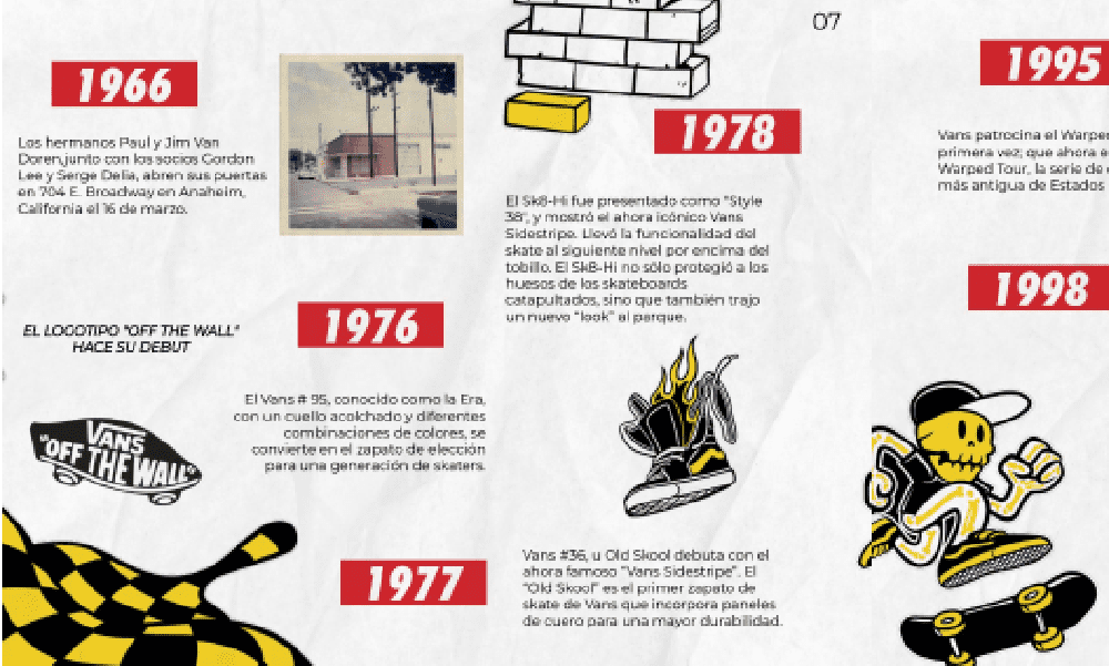
Brand book of Vans
Vans plunges us directly into the universe of the brand with many photos and colors. His brand book is very complete and presents in depth the brand, its history, its values and its charter.
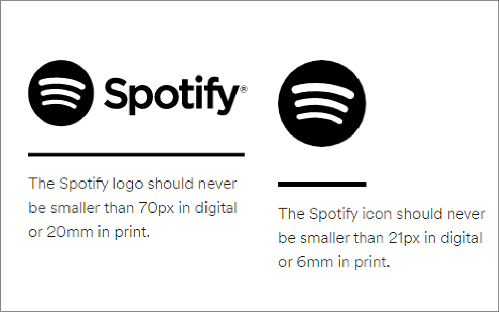
Spotify brand book
The brand book of Spotify is directly accessible on their website. Spotify gives a lot of details about the use of their logo, colors, pictures, sizes, locations, etc.
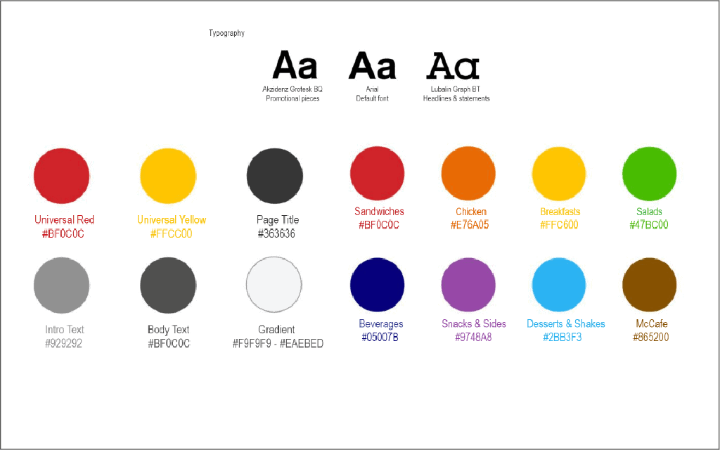
McDonalds Brand book
Just like Coca-Cola, McDonalds presents the evolution of the brand, its history and all the guidelines. Did you know that each type of product has its own color?
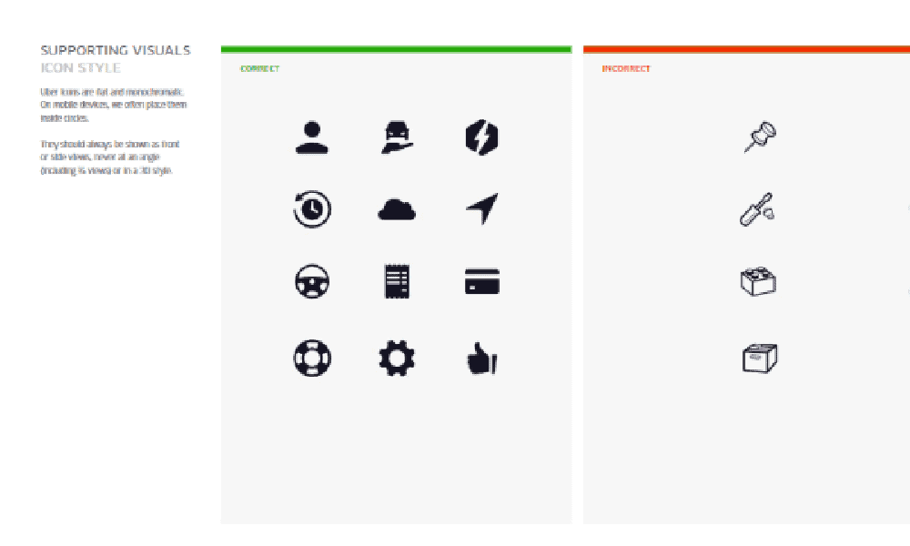
Brand book of Uber
The brand book of Uber is very pure and represents the brand well. This brand book is only composed of the graphic charter. And several pages are dedicated to the presentation of the logo.
3 tips to create your brand book
Before creating your brand book, make a list of all the people who will need it (employees, customers, partners, etc.). For each type of person, think carefully about whether they will find everything they need in it (web designer, social media manager, account manager, etc.). The brand book should become the reference book for all communication materials.
Your brand book is intended to be distributed as widely as possible. It must therefore be easily understood by everyone. Stay direct, simple and concrete. Avoid making promises, get to the point without detours. The brand book must be useful to your reader and make him want to read it to the end.
Design your document as a communication medium. Use your graphic and editorial guidelines 😉 and make it attractive and pleasant to browse. The brand book must let your brand identity shine through and must be consistent with its content. It will be one of the first documents that your customers and future customers will consult.
It's up to you!
Lors de la création de votre brand book, apportez une vraie valeur ajoutée, soyez simple, direct & créatif ! Et n’oubliez pas, le mot d’ordre est CO-HÉ-RENCE !
Now that we've shared everything we know, it's up to you! Or contact us, we can't wait to think about your identity and design your brand book together 🙂 .